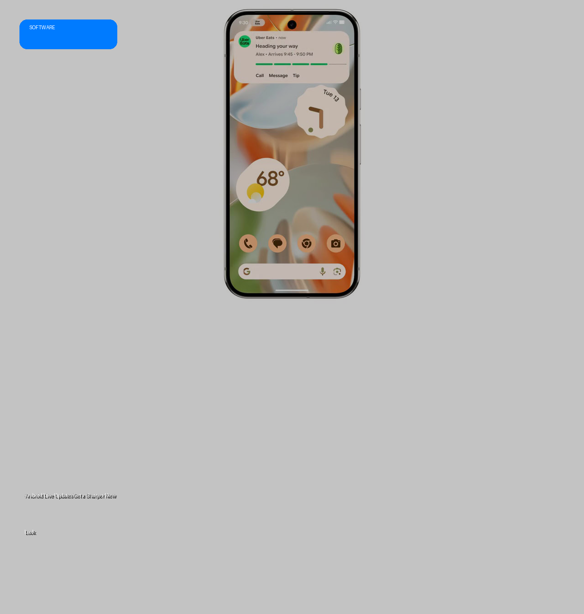
- Google is rolling out a significant visual redesign for Live Updates in the latest Android Canary build.
- The update prioritizes making the real-time progress bar more prominent across the home, notification, and lock screens.
- Key changes include repositioning app icons to the top and introducing more visible, pill-shaped buttons.
- This refinement aims to enhance the clarity and user experience of live activity notifications.
The Evolution of Live Updates
Google introduced Live Updates with Android 16, a crucial feature designed to provide real-time activity updates through a distinctive horizontal progress bar. This floating notification style, reminiscent of iOS Live Activities, was initially conceived for dynamic services like food delivery or ride-hailing applications. Google expanded its utility by testing it within Google Maps to display route segments and traffic density, proving its versatility beyond its original scope.
The Redesign Rationale and Execution
The latest Android Canary build reveals a deliberate visual overhaul aimed at improving the legibility and prominence of Live Updates. The primary goal of this redesign appears to be making the progress bar unequivocally clear and accessible to the user at a glance. By optimizing the layout, Google is enhancing how users perceive and interact with ongoing activities without needing to fully engage with an app.
Significant changes include the repositioning of the app’s icon from the left side of the tile to the top. This strategic move frees up critical horizontal space, allowing the real-time progress bar to expand across the entire width of the Live Updates tile. Furthermore, the buttons within these notifications have received a visual upgrade. Previously, buttons were represented by text alone; now, they feature a more prominent, pill-shaped border with text, although they are not yet filled in, suggesting this might not be the final aesthetic.
Specs & Data: Visual Comparison
The following table outlines the key visual adjustments spotted in the Android Canary build:
| Feature | Previous Design (Android 16) | New Design (Android Canary Build) |
|---|---|---|
| App Icon Placement | Positioned on the left side of the tile. | Relocated to the top of the tile. |
| Progress Bar Width | Limited by the presence of the left-aligned icon. | Expands to utilize the entire width of the Live Updates tile. |
| Button Appearance | Text-only buttons. | Prominent, pill-shaped border enclosing text (not filled). |
| Design Consistency | Consistent, but with older layout. | New design consistent across home screen, notification shade, and lock screen. |
| Visual Elements (Colors, Thickness) | Unchanged. | Remain unchanged from previous iterations. |
Market Impact
While an incremental update, this redesign subtly refines the user experience for real-time information on Android devices. By making Live Updates more visually prominent and easier to interpret, Google enhances the overall usability of the Android platform, potentially setting new standards for how dynamic, time-sensitive notifications are presented. This could encourage third-party developers to adopt clearer, more user-friendly notification designs, contributing to a more cohesive and efficient Android ecosystem.
The Verdict
The visual overhaul of Android Live Updates in the Canary build is a positive, user-centric refinement. It addresses clarity and prominence, making real-time information more accessible across various device states. While not a groundbreaking feature, these thoughtful design improvements contribute to a more polished and intuitive Android experience. The wider rollout and potential further iterations from Google will be worth monitoring.
